Your Brand should be fed from multiple sources, like Arc
Or, why your strategy and experience are tied to what people feel about your product
After properly orienting to what I’m talking about, and how I’m going to talk about it, I’m going to break down each of my main categories within Product Harmony, all through the lens of the web browser Arc. Starting with the first, Brand.
I am an absolute sucker for branding. But not in the way seemingly everyone in the age of social media says, “You just gotta work on your brand bro.”
The kinda brand I dig is the, I just can’t get enough of how awesome this is, kinda brand. The details that not everyone notices, the subtle use of a font no one else has, the layers on top of the colors to give more depth, the feeling when a company actually knocks it out of the park.
Let’s level-set then on what brand actually is for a moment.
Brand == the story & emotional connection to the product people have, and the choices made to create, cultivate and nurture it. The aim of this is to be a positive association, but it isn’t always, and involves much more than the actual product. But includes marketing, coloring, copy-- every touchpoint should reinforce it.
I’m a gearhead, I love cars and anything I can get on or in that goes zoom-zoom. Knowing that pension, I have to say BMW’s “the ultimate driving machine” so well encapsulates their brand and what they’re going for. It seemingly explains everything from why BMW drivers are always cutting me off, or why their cars tend to break down and need attention more often than their competitors-- but no one who buys them cares.
You buy a BMW for “the ultimate driving machine,” you won’t care that they break, or that their drivers are known for road rage, because what the company is bringing is that driving experience. If you want something that always works, you’d get a Lexus.
I love branding so much that I will spend time I don’t have, for a duration I’d rather not be honest about, just exploring all the different aspects of a company’s brand. I’ve done that with Arc’s brand, and it is nothing short of being in the tip top tier of the brands I’ve come across.
Arc’s Brand is a masterclass in intentional language
Let’s get started with a few of the aspects they leverage to express their brand.
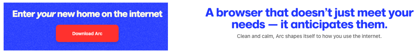
They speak very personally, this is your new home, this is the chrome replacement you’ve been waiting for, it doesn’t just know your needs, it anticipates them.
This is an impeccable setup to prime you to feel something ( a key component to branding, nurture and spark the feeling you want to invoke ). With Arc’s personal approach, when you use one of their many features for the first or hundredth time, you may start to associate the people building it with a sense that they’re taking care of you.
In relationships, it’s all about expectation and follow through. Your relationship to a product is no different, and Arc is setting up your expectations to know they’re going to always be one step ahead of what you think you want. Which when done right is a home run, but if you set that bar and never reach it, you’re in for some serious trouble.
Writing the copy in this way is leveraging a conversational tone to describe the product. With so much product copy taking on a strictly business tone that conveys authority, speaking plainly helps captivate your audience more. That is, unless authority is necessary for your audience, I wouldn't want my tire company being cheeky.
But when done right, a conversational tone tied with metaphors or analogies can explain complex concepts in a way that's easy to understand. Do that well, and you'll be able to capture whole new customer segments.
Arc's brand design and consistent visual language
I also have to give a huge shoutout to how much I adore the pixelated effect they have on the background colors for their website, an amazing way to set up something subtle that looks different than what’s out there. It reminds me of when google first put out the flat material design before it’s become everywhere, in the way it drew me in to go “ooooo I like that!”.
![]()
That visual pixelated effect carries through the whole website and has the app experience as well. All aspects of your product should feed the brand, that's harmony. Because that consistency is going to reinforce what you're doing, the expectations your customer has and how they're going to feel about your product.
Maya Angelou said something profound about relationships that I think frequently about in my personal life, but directly applies to the point I wish to make here.
"I've learned that people will forget what you said, people will forget what you did, but people will never forget how you made them feel." - Maya Angelou
If a product wrongs you, frustrates you, confuses you, that will be the filter that you pass everything else through. They come out with a new feature or drop their price?
You'll remember that frustration first. So don't sleep on your brand.
Arc makes it a point to prime their audience with the language, sure, but the design aesthetic that they pull through with their use of whitespace and negative space to create a clean and minimalist aesthetic, reinforces that language.
They’ve also flipped the place where normal browsers have their menus / toolbar etc, to be on the left and vertical. Choosing to put the URL bar as a small item on the top left is an experience and design decision, however that plays right into the brand that they want to convey: this ain’t your typical browser, you’re in new territory. This is also time for me to re-introduce and underline the Brand | Experience | Strategy heuristic, each aspect can overlap and should overlap.
How Arc displays the tiles, how they layout folders, tabs, all of that is the experience ( and I’ll talk about this in Experience ). But part of what makes my love affair with Arc so complete, is that it reinforces the brand. That’s product harmony 🌱.
Arc is setting you up to believe that they care about how their users navigate the internet, which is what we need a web browser for in the first place! And wants you to feel taken care of.
THE Web Browser
They’re also setting themselves up not just as another web browser, but THE web browser for the next age. Brave tried doing this with web3, and well, there was an attempt. As much as I adore what Brave is doing, their search engine and even more so their brand or browser, it was just chrome with a lion icon, some more privacy built in and a web3 wallet with tokens.
For what it’s worth, I do really dig the privacy focus and I do use search.brave.com as my primary search engine. But they haven’t differentiated as anything substantive given web3’s much slower than hyped rise.
Arc by comparison, marries their features with the brand to deliver an experience that’s much different than their competition. So when they come in with that cheeky, slightly snarky delivery, it matches the experience that they are providing ( and will vibe with their target demographic they’re shooting for, see Strategy for more detail on this 😏 ).
Arc does a few subtle things to remind you that you’re inside their curated experience, a different one which reinforces their brand. For example, they allow you to take control of the colors / theme of the browser just like any other. But what they do that’s different, is they alter the colors ever so slightly so that you’re viewing a gradient.
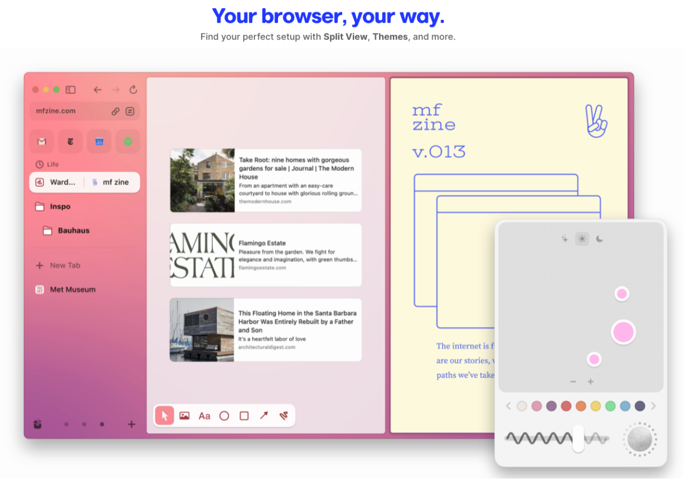
Arc incorporates subtle animations and transitions to create a sense of fluidity and continuity as you navigate around the application. Delightful as they are, they also help to reinforce where you are in the application and what it is you're doing.
How their brand is presented and expressed to the user doesn’t start on the marketing site’s copy, but all the way through to the actual use of the application. Hell, it’s an experience decision to have opening a new tab pop up a control bar that’s similar to Mac’s spotlight search, but in doing that it reinforces the brand presentation that hey, we’re going to do things for you, all you need to do is tell us enough to get an idea and we’ll make suggestions.
Not to mention, have you ever seen that type of experience on a browser before?
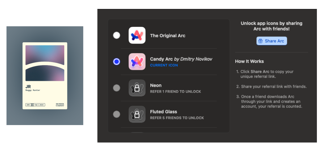
Their brand is also built around Arc being more, which also extends to the community aspect of it and how they nurture that. From encouraging you to share the app to get a different app icon on your dock, to cultivating a brand messaging in their marketing that is so forward about doing something different, if you love it how can you not chat about it at length.
This is something I’m guilty of, and so are a few more people I know ( Connor being the loudest of them 💛 ).
If people can’t stop talking about a product, that’s one of the highest tiers of a well crafted brand execution. Would people be talking word of mouth about Arc if they didn’t build in all this language and marketing around being different? Sure, but would it be as probable? I certainly don’t think so.
The overall design of the app is also a bit familiar a la Steve Jobs’ iconic Zen aesthetic, but different enough that it doesn’t feel like an Apple product-- or really any product I’ve used before. It sits just in the sweet spot of being something new, yet still something I’ve seen enough that I don’t reject it outright as ugly or unusable, simply because it’s different.
To create product harmony, you need to organize an ecosystem, not check a box. That Apple spotlight search inspired the new tab menu, reinforces the experience in a way that’s likely very similar to their target demographic ( more on this in the Strategy post, but they went after Apple users first ). Not to mention the open world they’re trying to bring people into with an AI powered web browser, to make the user’s life better through a better internet experience.
This isn’t a product and a company that’s one in the same as Brave is. This is Arc from The Browser Company. It’s a bit like THE Ohio State University in how it’s laid out, but it works to drive a point home; this isn’t a company that’s trying to do a bunch of things or have a message within their product, it’s just trying to make a great browser for you that makes your life easier by focusing on web browsing. Impeccable.
Then there’s the marketing. Damn are they hitting that out of the park. It certainly helps to have a very charismatic CEO, and I’m sure his energy flows into his team and the people who come to work with them ( more again on that in Strategy ). But they still have to execute it. From their series that’s currently dropping on “How we might not make it,”](https://www.youtube.com/watch?v=foisAkpaCGo) onto the way they rolled out their MAX AI features, it’s all flawless.
Just the right amount of entertainment that you want to watch the ad, but it never shies away from what the purpose of it is in the first place- get you to use the thing. This goes back to my point that I started with on product copy, every touchpoint helps to cultivate the relationship to the company, getting you to feel like you know who’s building it for you.
Consider Patagonia as another example, even if you don’t know the CEO you know what that company is about. From their logo, product copy, or even the prototype of the person who is clad in their gear. With The Browser Company, you know what they’re about and it helps cultivate loyalty + excitement which translates to users getting you more users ( like what I’m doing here 😏 ).
Arc just has clear language that gets to the point, but demonstrates the value in a way that we can see exactly how it would help.
Clear and concise language that all serve to reinforce the message that they’re trying to express. Which gets people in to try the product from the clear example of the value they’re focusing on.
The rest of their intentional choices from shots fired at Chrome or the minimalist aesthetic nurture that relationship between the product and customers. Something that companies focus all their attention on in the beginning, and all too often ignore as they mature.
Some key takeaways to end on
Branding is not just about having a logo or a tagline, but about creating a story that evokes emotions and creates a connection with your customers.
Intentional language and design will make a huge difference in how your brand is perceived by your users, don't sleep on investing in that because the new competition won't. ( because they can't )
Being unique is not just a nice-to-have, but a must-have in today's market that's crowded for attention and capital.
Creating a unique experience for your users is key to building a loyal following and driving growth.
Arc's brand is a masterclass in intentional language, design, and experience, and we can all learn from their approach.
I’ll end this post with where I’m going next, Experience. As a teaser, I’ll give what I think the definition of design is.
Design is the recognition that everything is a choice, and the sum of those choices emerges as the design. 🤘🎨🤘